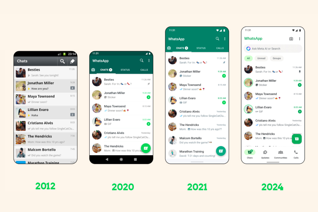
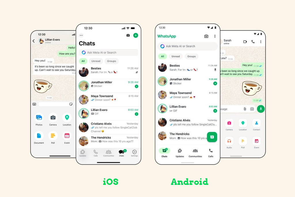
WhatsApp has just announced for WhatsApp new Design and the official rollout of a significant update that brings a refreshed design to its popular messaging app on both iOS and Android platforms. This update introduces a range of visual enhancements aimed at making the user experience more seamless and visually appealing.
A Fresh New Look for WhatsApp
The most noticeable change in this update is the app’s renewed embrace of the color green as its primary accent color. This color is now prominently featured in various elements, such as notification badges and buttons, giving WhatsApp a more cohesive and unified look.

This design shift is especially apparent on Android, where the tab bar has been moved to the bottom of the screen, aligning the Android app’s layout more closely with that of the iPhone version.
Dark Mode Enhancements
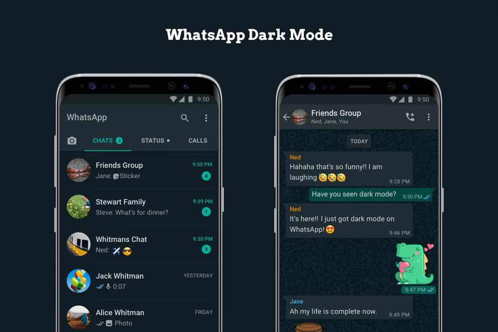
For users who prefer Dark Mode, WhatsApp has made specific improvements to enhance the experience.

The app’s colors have been adjusted to offer higher contrast and darker tones, catering to those who requested a “darker dark mode” to reduce eye strain in low-light environments. These adjustments make it easier on the eyes, especially during nighttime use.
Updated Icons, Illustrations, and Animations
In addition to the color changes, WhatsApp has revamped its icons and illustrations, opting for a more rounded and contoured style. This gives the app a modern and polished appearance. Moreover, new animations and chat wallpapers have been introduced, adding a fresh touch to the overall user interface.
WhatsApp’s Design Philosophy
WhatsApp’s design team has emphasized that this update is more than just a visual overhaul; it’s about enhancing how users communicate on the platform. With over 2 billion users worldwide, WhatsApp’s design philosophy is centered around simplicity, reliability, and privacy. The goal is to create an app that feels like a natural extension of your phone, allowing you to focus on meaningful conversations without distractions.

According to WhatsApp, the key to successful design lies in making the app intuitive and easy to navigate. By paying close attention to how people use WhatsApp on their devices, WhatsApp aims to create a user interface that feels familiar and complements the existing experience on smartphones. If you know how to use your phone, using WhatsApp should come naturally.
Global Rollout and Availability
These design changes have been in testing with WhatsApp beta users for some time and are now being rolled out to the public worldwide. This follows last month’s update to the iOS app, which introduced support for passkeys, further enhancing the app’s security features.
With this update, WhatsApp continues to refine its platform, ensuring it remains a top choice for messaging and communication across the globe. Whether you’re on iOS or Android, the refreshed design aims to make your WhatsApp experience smoother and more enjoyable than ever before.


I like the new design! It looks cleaner and more modern.